
Bold and Beautiful: Using Color Trends in Boyertown, PA Kitchen Remodeling
If you live in or around Boyertown, you already know how much character these older homes have. They feel solid and inviting, but the kitchens often show their age with worn flooring, dim lighting, or cabinets that haven’t been updated in decades. When you start thinking about kitchen remodeling, color becomes one of the first big decisions. It can feel exciting at first, then overwhelming once you realize how many options there are.
That reaction is completely normal. You want a kitchen that feels fresh without losing the charm that makes your home special. You want a space that feels personal and warm instead of something that will look dated again in a year. And you want your choices to fit the style of your Boyertown home, whether it’s a Colonial, Cape Cod, or mid century layout.
So, let’s talk about how color can support your kitchen remodeling plans in a simple, practical way. We’ll look at local patterns, helpful examples, and ways to make these decisions feel easier. By the end, choosing colors will feel less like guesswork and more like a natural part of planning your new kitchen.
Why Color Shapes Your Kitchen More Than You Think
Color does more than change how your kitchen looks. It changes how the room feels. It’s often the first thing you notice when you walk in, and it quietly influences whether the space feels open, cozy, bright, or balanced.
If you’ve ever brought home a sample that looked perfect in the store but completely different in your kitchen, you already understand how unpredictable color can be. Lighting, layout, and the age of your home all play a role. A small Boyertown kitchen with limited daylight might make a color feel darker than expected. A home with original wood trim might shift how a gray or beige reads. Once you start noticing these details, color becomes less mysterious and much easier to work with.
Homes across Boyertown often have beautiful architectural elements that are worth honoring. Natural wood trim, warm floors, and unique kitchen footprints all influence which colors make sense. Some modern shades can feel out of place in a traditional home, while others settle in effortlessly. When you choose colors that suit your home’s personality, your kitchen feels more natural and more welcoming.
2025 Kitchen Color Trends That Fit Boyertown Homes
Color trends shift each year, but the direction for 2025 is pretty clear. Homeowners want warmth, personality, and a break from all white designs. You don’t need to follow every trend, but seeing what others gravitate toward can help you sort out what fits your own kitchen design plans.
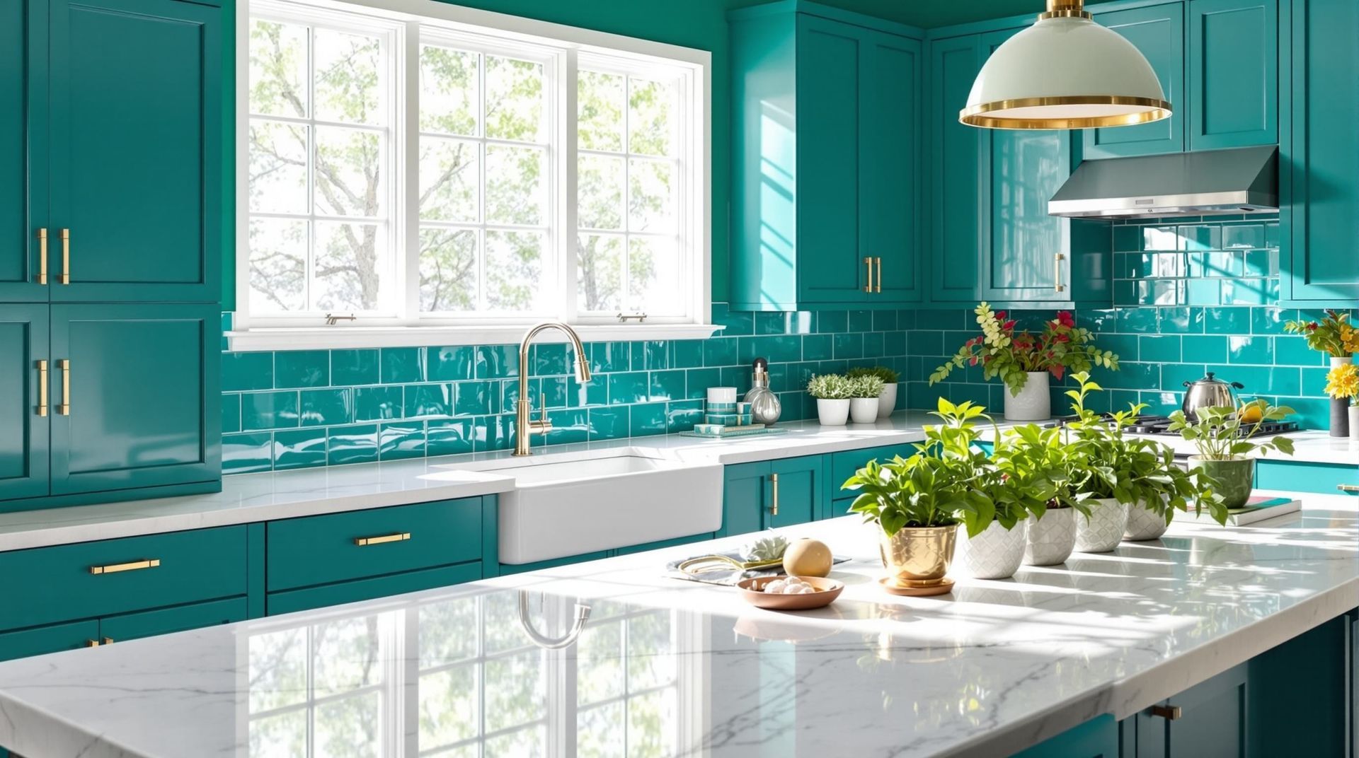
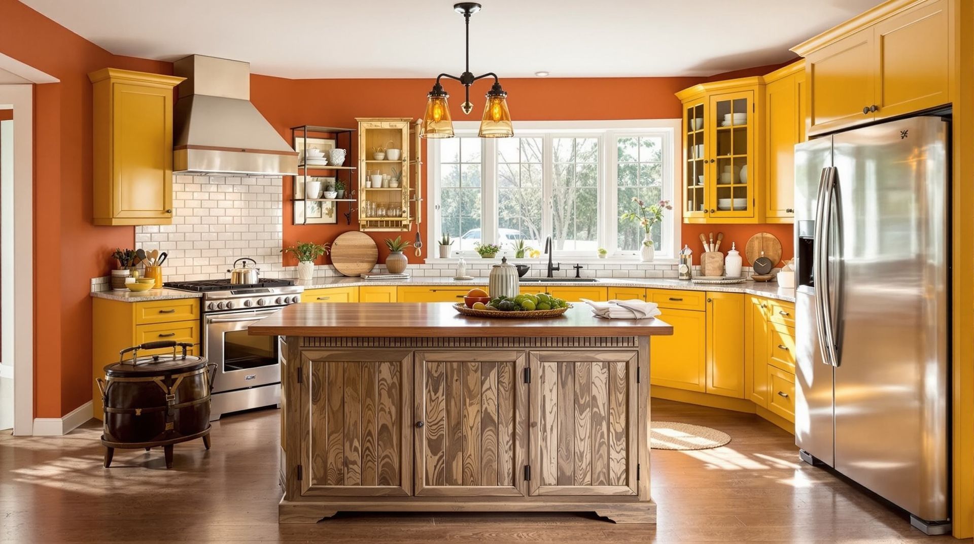
One trend that continues to stand out is the use of deep greens and earthy tones. These colors feel grounded and comfortable, which makes them a natural fit for older homes. A deep green island or a set of lower cabinets can add richness without overwhelming the room. These tones also work well with the warm wood flooring and natural textures often found in Boyertown houses.
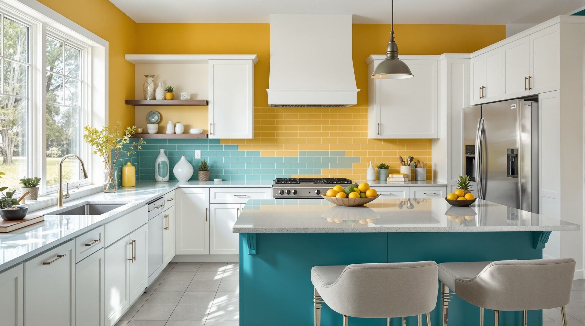
Another popular direction includes navy, slate, and charcoal. These shades behave like modern neutrals. They bring depth without feeling heavy and pair especially well with light countertops or a soft tile backsplash. If your kitchen gets limited daylight, you can still use deeper colors. Just balance them with warm lighting or lighter walls.
Warm neutrals are still going strong. Shades like greige, soft taupe, and warm beige blend easily with older flooring or natural trim. They give you a timeless backdrop that’s easy to refresh with hardware or small styling changes.
How to Choose Colors That Actually Work in Your Home
Picking the right color gets much easier when you follow a simple, practical process. Each of the steps below helps you understand how a color behaves in your specific space.
- Take a good look at your lighting. Many Boyertown kitchens were built with smaller windows or enclosed layouts. Pay attention to how bright your kitchen feels at different times of day. This tells you whether you should lean toward lighter colors for more brightness or whether deeper tones can work without closing in the room.
- Test your colors in real conditions. Samples in the store can be misleading. Put your color choices directly on the wall or on a cabinet door and check them morning, afternoon, and evening. Some shades shift dramatically. Seeing that shift early saves you from choosing something you’ll question later.
- Consider the materials already in your home. Original hardwood floors and natural wood trim have warm undertones. Hold your paint samples right next to them. If something feels off, trust that reaction. You want the room to feel cohesive.
- Think about whether you want contrast or a blended look. Both can be beautiful. Contrast adds energy, especially with bold colors. A blended palette feels calm and steady. Your personal taste guides this choice.
- Gather all your samples in one place. Countertops, tile, hardware, and cabinet finishes all influence your palette. Spread everything out on a surface and look at it together. When everything works, it’s obvious. When something doesn’t fit, you’ll see it immediately.
Following these steps makes the final decision much easier. When you slow down and observe your space, the right palette often becomes surprisingly clear
Practical Ways to Bring Color Into Your Kitchen
Color doesn’t need to feel intimidating. You can introduce it in subtle ways or go bold, depending on what feels right for your home.
Cabinets tend to be the biggest decision. If you’re drawn to a bold shade like navy or deep green, try using it on the island first. Some homeowners choose one color for upper cabinets and another for the lowers. This can give your kitchen a layered, custom feel.
Your countertop, backsplash, and hardware also play key roles. The biggest challenge homeowners run into is undertone mismatch. A paint color that looks neutral in the store might shift when placed next to warm wood flooring or cooler stone surfaces. Checking everything together helps you avoid surprises.
If you want color without making a huge commitment, try bringing it in through smaller elements. Here are a few easy options:
- A bold range hood
- A patterned or colorful tile backsplash
- Open shelves with colorful dishware
- Light fixtures or barstools with personality
- A section of accent wall or beadboard
These touches can add energy to the room while still keeping the overall palette flexible.
Avoiding Common Color Mistakes
Even with good intentions, color choices can go off track. Knowing what to watch for helps you avoid the most common pitfalls.
One of the easiest mistakes to make is choosing a shade that feels too trendy. It may look great online but not quite right in your home. If you’re unsure, try using the color in a smaller way first. An island or backsplash is easier to update than a full set of cabinets.
Another issue is undertone conflict. A gray with blue undertones can shift oddly next to warm wood. A beige might turn pink when placed beside certain flooring. Laying out all your samples side by side helps you catch these conflicts quickly.
Daily life matters too. Kitchens see constant traffic, spills, and fingerprints. Certain finishes and colors show wear more easily than others. Thinking about how your kitchen functions day to day helps you choose colors that stay beautiful with minimal stress.
When you take your time and observe how colors interact in your home, you avoid most of these problems before they happen.
Bringing It All Together
Choosing colors for your kitchen remodel can feel like a big task, but once you break it down, it becomes much more approachable. You start to notice how lighting shifts throughout the day. You see how your flooring and trim influence the colors around them. You understand which shades bring out the best in your home’s character.
The goal isn’t to chase trends or match what you’ve seen online. The goal is to create a kitchen that fits your life. A kitchen that feels comfortable from the moment you walk in. A kitchen that reflects who you are and how you live.
When you move slowly, test your colors, and choose what truly feels right, your palette becomes personal and lasting. And that’s what makes the heart of your home feel genuinely yours.
